
ExploraStory is an AI-powered remote research platform that connects brands directly with users,
helping them study experiences as they occur and empowering internal teams to generate insights in hours instead of weeks.
Team
Samantha, John
Duration
8 weeks
Duration
8 weeks
What this platform offers
The Complete User Research Workflow

Why explorastory?
Built to go beyond traditional research tools
While existing tools enable usability testing and research analysis, they remain fragmented, slow, and disconnected from real-world user behavior.
ExploraStory was designed to unify the research process into a single, real-time system- allowing teams to capture authentic user experiences, analyze them using AI, and generate actionable insights within hours instead of weeks.

Find where users drop or switch
Track user journeys across your app to identify friction, drop-offs, and missed opportunities.
Understand what drives engagement and retention.
Get rewarded for your time
Users receive incentives for participating in research.
Encouraging authentic engagement and higher-quality insights.

Turn Data into Action
Analyze behaviour at scale and uncover patterns instantly.
Capture Real-Time Insights
Collect feedback and behaviour as experiences happen. Get faster, more accurate insights without relying on memory.

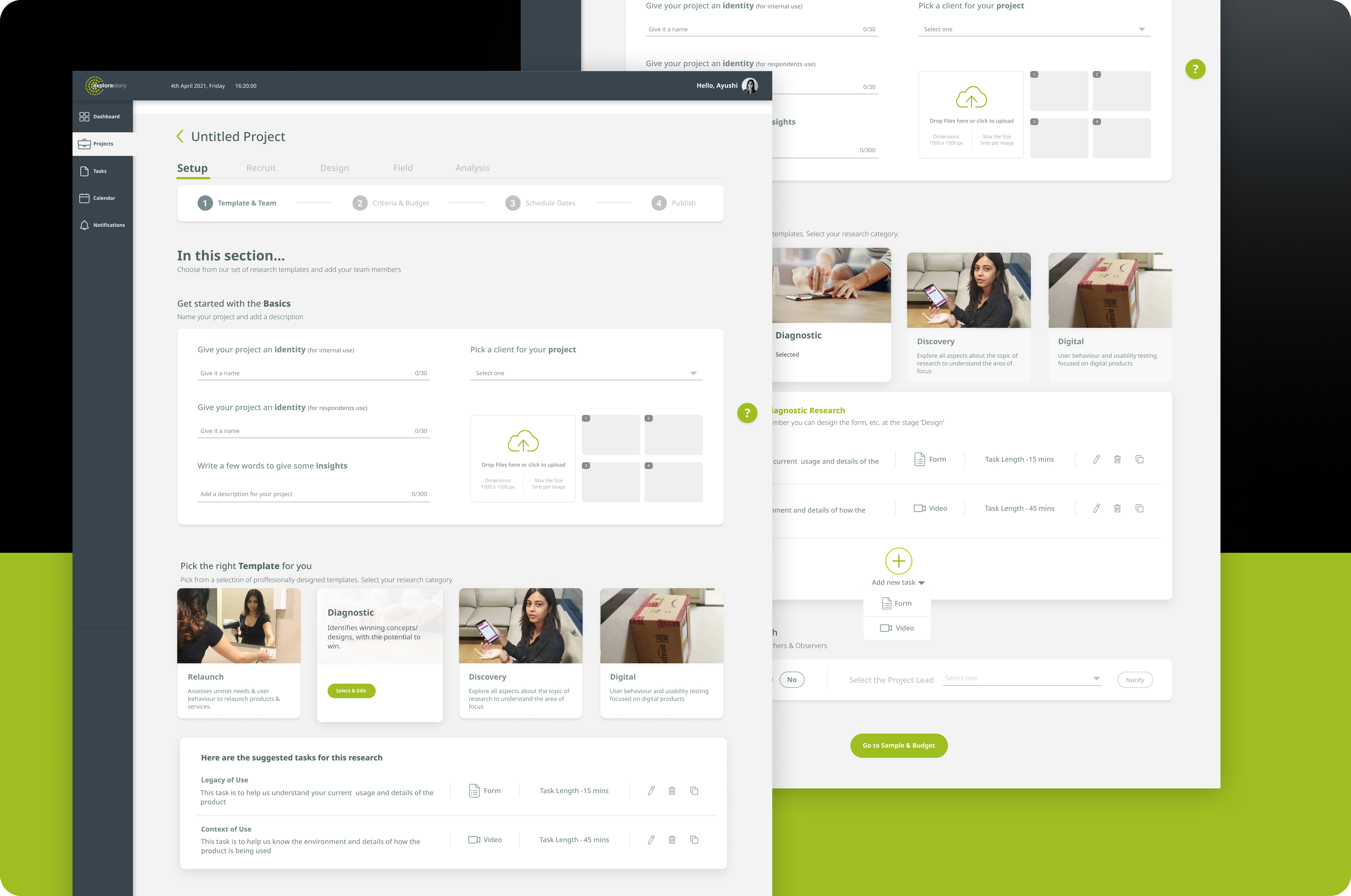
My Role in Designing the Research Workflow
Simplifying how researchers build and manage studies
Researchers often struggle with fragmented tools and unclear processes when setting up studies.
The goal was to design a structured, guided workflow that simplifies how research projects are created—from setup to execution.
My Role in Designing the Research Workflow
Component level design
Researchers often struggle with fragmented tools and unclear processes when setting up studies.
The goal was to design a structured, guided workflow that simplifies how research projects are created—from setup to execution.

My Role in keeping users engaged
Letting users to take their awarded participation anywhwere
We wanted users to comfortably take the task, designed phone cards and tested with internal design teams to seeinteraction where not only users understanding different rewarded projects to choose but also keep them engaged
What was my role here
I was a part of the initial building
Impact on Conversions (Before Redesign)
User conversion data that revealed friction points and informed the redesign strategy
Even with a trusted brand and quality products, Kim’C Market’s digital experience revealed pain points in the user journey. Elevated bounce rates, frequent cart abandonment, and underperforming mobile conversions highlighted usability barriers that hindered customer flow and limited growth potential.
Low Conversion Rate
Cart Abandon Rate
Bounce Rate
Who were we solving for ?
Diary study- Understand the first-time and returning user experience
Through a cross-platform diary study, we observed how users naturally engaged with the product. Their notes on confusion, hesitation, and drop-offs helped us identify where experience gaps occur in real contexts.

How did we uncover where users were experiencing friction?
Eye Tracking Heatmap– Tracking eyes, tracing friction
Usability sessions with 8 users combined eye-tracking (Tobii) and behavioral analytics (Clarity).
Heatmaps showed hesitation around navigation, pricing, and product pages.
Post-test interviews unpacked the “why” behind user drop-offs.


How did we uncover where users were experiencing friction?
Where Users Drop Off: Identifying Barriers to Conversion
A breakdown of usability and trust issues impacting decision-making at each stage of the shopping journey

How did we decide what to design and why?
UX Principles Shaping a More Confident Grocery Shopping Experience
Defining the core design principles that informed layout, pricing clarity, and behavioral flow across the shopping journey

Solution
Making orders feels effortless
We proposed targeted design solutions that addressed the most critical usability challenges. From product discovery to pricing clarity, each change aimed to reduce friction, improve trust, and enhance the overall shopping experience.


Where it landed
We presented at NYC
I had an amazing opportunity to present the case study at a workshop hosted by NYC User Experience & Digital Product Designers. We hosted a demo session alongside the presentation, allowing participants to try the eye-tracking heatmap and Microsoft Clarity.


Where it landed