SITA is a global aviation technology company with a complex ecosystem of B2B products and services.
Its customer experience was fragmented across 12 businesses, creating disconnected entry points, inconsistent service access, and limited visibility across products.
I co-led the strategy and design of a unified portal, bringing these experiences together into one scalable platform with a single login and a more coherent customer experience.
Employer:
Foolproof — client: SITA
Duration
Jan 24 - Jun 24
Overview
The work focused on understanding how customers moved between accounts, subscriptions, services and performance data, and identifying where the existing experience created unnecessary friction. Rather than treating each journey independently, we approached the experience as a platform design problem, establishing shared patterns that could support both current services and future growth.
Stakeholder
The project required close collaboration with SITA leadership, Managing Directors, product teams, the Head of Design, Zensar engineering and SITA’s in-house design team. A key part of my role was aligning different business requirements around shared journeys while ensuring individual teams retained the flexibility their products needed.
Problem
⚡ The Challenge: How might we make a highly complex product ecosystem feel clear and connected without removing the depth individual services require?
Research surfaced multiple authentication journeys, inconsistent navigation and interaction patterns, limited visibility across services and performance data, and fragmented ownership between business units. The design challenge became finding the right balance between simplicity for customers and flexibility for the businesses behind the platform.
Defining success early
What would a unified experience need to achieve?
Before moving into detailed design, we aligned on what success needed to mean for both customers and the organisation: simpler access, greater consistency across services, clearer visibility and a foundation that teams could continue building on.


Engagement
0%
Retention
0.0%
Team take-up
0%
Who were we solving for ?
Mapping a fragmented B2B ecosystem
I mapped how customers moved across SITA’s businesses, accounts and services to understand where journeys overlapped, where they diverged, and where fragmentation created friction. Working with leadership, product and engineering helped us connect customer pain points with the organisational and technical constraints behind them.

Initial Dashboard experience in-line with old brand guideline. Menu interaction detail - desktop view.
Understanding the complexity behind access
Mapping the journeys behind a single login
Although the goal was to create one simple entry point for customers, the experience behind it involved multiple user states, authentication paths, validation rules, onboarding and subscription access.
I mapped the registration and login journeys end-to-end to expose these dependencies, identify failure states and align product, design and engineering around how customers should move from authentication into DigiHub.

Understanding the context of use
Designing for where the work actually happens
Research showed that SITA services were primarily used in desktop-based work environments during operational hours. These weren't casual interactions; users were managing complex tasks, reviewing information and making informed decisions.
That gave us a clear direction: design the platform desktop-first, prioritising information density, clarity and deeper data interaction rather than spreading the experience across contexts that weren't meaningful to users.

From insight to platform
One entry point, with depth when users need it
The resulting experience brought services into a shared DigiHub framework while allowing specialist products to retain the depth required for operational work.
The dashboard gave customers a clearer starting point, while deeper service experiences could support complex tasks, analytics and operational decision-making without overcrowding the top-level experience.
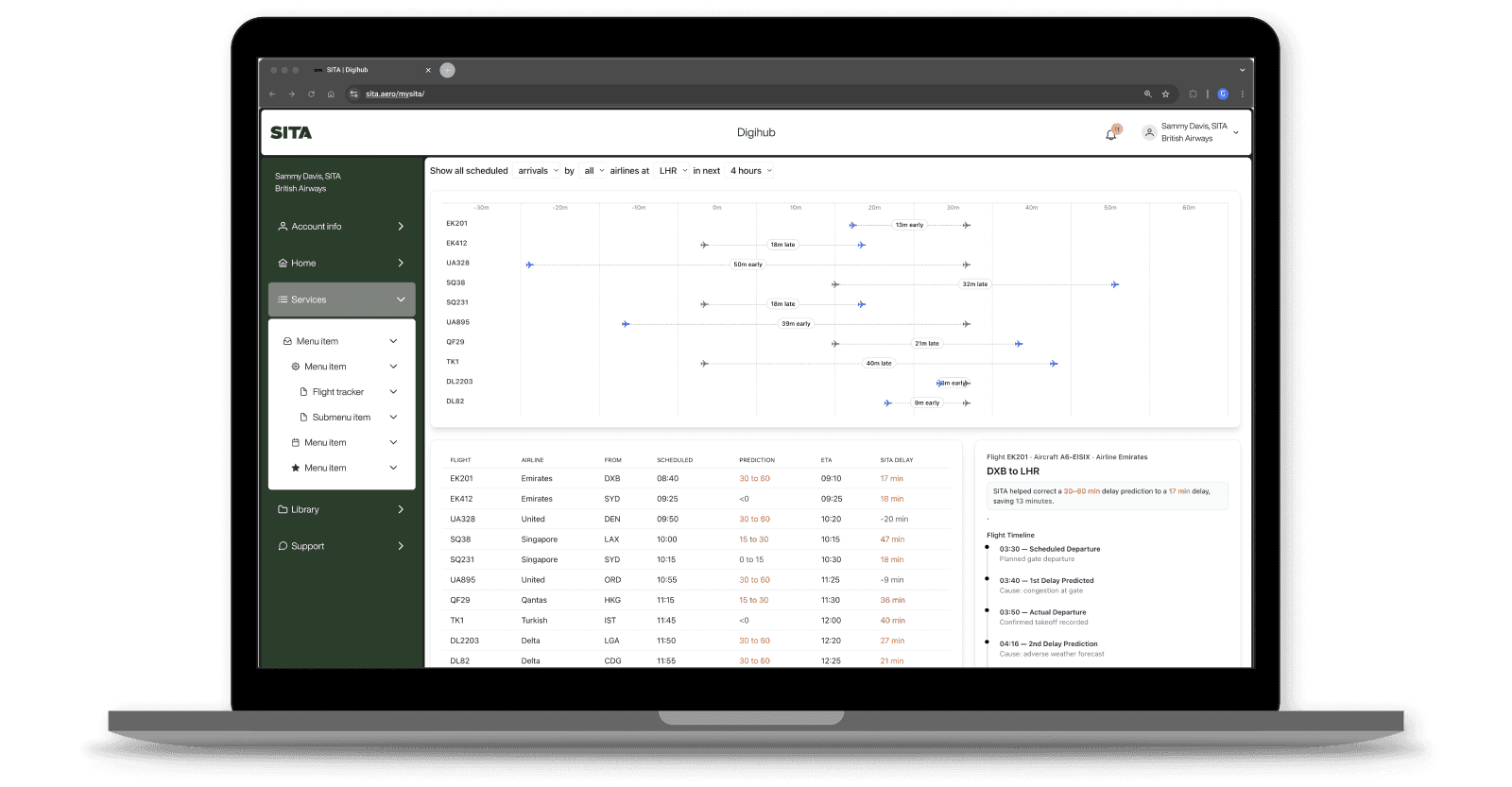
Simple at the platform level → detailed at the service level.
Extending the platform into service workflows
Designing beyond the dashboard
Alongside the unified portal experience, I also contributed to service-level workflows within the SITA ecosystem, including the i-Expense journey used to create, submit and approve employee expense reports.
This work explored how the same platform principles could support more detailed transactional tasks across desktop and mobile, while maintaining consistency in navigation, status and actions.


Simple at the platform level → detailed at the service level.
Designing beyond one release
Building consistency without restricting teams
Alongside the product experience, we created a flexible design system with shared UI rules, reusable components and a common visual language.
The goal wasn't to make every SITA product identical. It was to establish enough consistency that customers could move confidently across services while giving product teams room to support their individual requirements.

Simple at the platform level → detailed at the service level.
Testing the direction
Validating more than the interface
Because this involved multiple businesses, validation wasn't only about usability. We used stakeholder reviews, journey mapping, iterative design discussions and close engineering collaboration to validate customer needs, technical feasibility and organisational alignment as the platform evolved.
Simple at the platform level → detailed at the service level.
Reflections